Wednesday, 30 November 2011

Locations

There are 3 locations where I will film the horror opening sequence. It starts outside in a wooded area and a local chalk pit. Later in the sequence Heidi wakes up at home.

The Woods

Shots: 3-14
Why have I chosen this location: Woods are fairly sinister to start with, they give off a feeling of isolation as there are no buildings around. This means that if something were to happen (which undoubtedly in a horror film, it will) there is no one around to help you.
Conventional of horror?: Yes, for the above reasons. Forest locations are used a lot in horror films, for example The Blair Witch Project (1999)
Risks/Potential problems:

  • It is a public place that is very popular with dog walkers. It could be hard making sure that no one else is in shot. The same goes with wildlife, a rouge squirrel could change the atmosphere completely. 
  • The weather: If it is particularly muddy that could pose as a problem because a lot of the scenes require running. If Heidi slips over because it is muddy not only will that take be no good but the rest of filming would also be in jeopardy because suddenly being covered in mud would ruin the continuity of the sequence.


The Chalk pit

Shots: 16 - 30
Why I have chosen this location: This will act as a good dead end to stop the chase and slow down the pace of the sequence. Also the cliff face (I say cliff face, it isn't as tall as a cliff but there is still a fair drop) will allow me to get a good range of shot types.
Horror conventions: I can't say this is overly conventional as I am not aware of any previous horror films to feature such a location but having said that the back drop is still woodland.
Risks/Potential problems:

  • To get the shots I have planed I need to take the camera very close and possibly over the edge of the chalk cliff face/drop. Obviously this is relatively dangerous as I could fall over the edge but I think that is fairly unlikely. I have been to this location a fair few times and never run into too much trouble or got seriously hurt so this will not be a problem. I think it is also important to stress that I am not putting my actors into any potentially dangerous situations. I would hate to be responsible for their injury but if I fall and break something its my own fault.


The Bedroom

Shots: 31 - 46
Why have I chosen this location: This location is for when Heidi is waking up from her bad dream. It makes sense to film this in my bedroom as I have unlimited access to it and is a perfect setting for the action.
Horror Conventions: Horror films do often feature familiar homely settings. I think this is scary because if there is one place you should feel safe its your own home. This is the case in Halloween (1978) where the antagonist stalks a teenager in her own neighbourhood and eventually chased and attacked in her neighbours house.
Risks/Potential problems:

  • There is not an abundance of space in my bedroom and getting all of the shots and angles I want could prove tricky.

Tuesday, 29 November 2011

Character profiles

There are only two characters in my opening sequence: the victim Heidi and the anonymous antagonist.

Heidi
Name: Heidi
Played by: Heidi Green
Age: 18
Hair colour: Blonde
Personality: Very outgoing, has lots of friends.
Likes: Shopping, going to the cinema, socialising with her friends, listening to pop music.
Dislikes: Spiders, the dark.
Family: She has a Mum, Dad and a younger sister although she lives with a couple of housemates rather than her family.


This character is extremely conventional of victims in the horror genre. She could be compared to Laurie Strode, the 17 year old babysitter who is pursued by Michael Myers in Halloween (John Carpenter,1978)

The Antagonist

This character is purposefully mysterious and not a lot is know about him. Having the antagonist as an illusive character acts as another device to create tension. The audience never sees his face as he wears a skeleton mask to hide his identity. Is adds enigma codes as to who he is.      
This is also a convention of the horror genre. Villains in other horror films such as Scream (1996) and Friday the 13th (1980) also wear masks to hide there identity.


Monday, 28 November 2011

Production schedule

A production schedule is used to organise times to film, locations of filming, what to take and who needs to be there. They are exceedingly useful and easy to use. Here is the one I will use to help me film my sequence successfully.


Shots to be filmed
Date/time
Location
Actors
Props/costume
Risk Assessment
1-30 (excluding titles)
29/11/11
The woods
The Chalk pit
Heidi
Ben
·         A knife
·         Skull Mask
·         Fake Blood
·         Using a real knife poses certain safety issues.
·        Someone could fall of the chalk wall onto the rocks below.

31 -46
29/11/11
My house
Heidi
Ben
·         A knife
·         Skull mask
·         Mobile phone
·         Once again the use of the knife is potentially dangerous


To avoid injury with the knife will only take common sense so it isn't too much of an issue. I'm sure both of my actors and myself can handle such a thing in a responsible manner.
The chalk wall also isn't too much of a problem as only I (because I will be filming) need to go up there. I have no problem at all with this, it's fairly unlikely that I will fall off.

I realise that planning to film all of it in one day is slightly ambitious of me but if we do not manage to complete it I still have plenty of time to arrange another day of filming.

Saturday, 26 November 2011

Production card - Lunch time films

Here is my second production card, for this one I decided to get a little more complicated and use stop motion. Ingredient by ingredient a sandwich is constructed, finishing with the words 'Lunch Time Film' on the top. This is shown by an aerial shot.

Filming this one took a long time. Failed experimentation of the use of cheese as an artistic medium is to blame for this. My original plan was to spell out the words using mayonnaise, unfortunately this was unsuccessful as was tomato ketchup. But, eventually I figured out the best method to fashion cheese into letters and I'm fairly pleased with the end result.

It is very different to my first production card which is what I was aiming for:

Friday, 25 November 2011

Production card - Typeface Productions

For this production card I decided to keep it simple. I got out one of my typewriters and took a level angle close up shot of the words 'Typeface Productions' being typed.

Filming it took a long time. I had to do many takes to make sure I got the timing, rhythm  and sound of the typewriter perfect. It's surprising how many time I managed to misspell 'Productions'.

I put a black and white filter over it during editing because I didn't think the red band on the ribbon looked very good. I wanted to keep it as simple as possible.
Not simple enough

Here is my first finished production card, I think it is fairly successful and I am happy with the end result:

Monday, 21 November 2011

Animatic

Today I completed the animatic for my horror opening. It now has all of the transitions, camera movements, sound effects and dialogue. The music that accompanies the animatic will most likely be changed as a good friend has agreed to write some for me that will suit the action of the sequence. Unfortunately it has yet to be composed so it is absent at the minute.
Also absent are the production cards that I am in the process of creating.

Here is my finished animatic:

I think my animatic is successful as it shows the techniques I plan to include and accurately represents what my finished film opening will look like. This along with my story board and script will act as a guide for when I come to edit the real footage.


Saturday, 19 November 2011

More Production company logo ideas

On target films
The sequence: The words 'On Target Films' will be on little bulls eye targets.

Why?: One by one they will be shot and fall over or off a table. This plays on the phrase 'keep on target' introducing the idea of focus and staying on track to achieve an end goal


Tasty Productions
The sequence :Time lapse footage of a cake being put into an oven and rising.

Why?: I like this one because it sort of implies that films take time to create and grow and in the end they turn out really well. Much like a cake, if you don't cook it  long enough it will be sloppy and rushed and if you cook it for too long it will be burnt and overdone.

Thursday, 17 November 2011

Production company logo ideas

Production company logos appear at the start of a film to advertise and let the viewer know who made the film. They are often not related to the film at all but they do reflect the company they represent. For example Beyond Films: 


The camera goes beyond the moon and beyond the earth and off into space. The idea they go further with their films is present throughout.

My Ideas:
Typeface Productions
The words 'Typeface films' will be shown being printed by a typewriter, the framing will only show the words and not the hands typing them. I believe this simplistic concept will look very impressive at the start of my horror sequence.

Lunch Time films
A short stop motion animation of a sandwich being made component by component. After several ingredients the words 'lunch time films' will appear written in mayonnaise and then the top slice of bread will go over the words. Here the stop motion will end and two hands will appear and take the sandwich, after a moment the sandwich will reappear but with a bite taken out of it.

Monday, 14 November 2011

Scripting

Today I wrote the script to accompany my sequence. It took me quite a while to do as I had to get used to the program but once I got the hang of it the process was simple.
The whole of my script can be found here: Horror Script

My script clearly shows shot type, the action and the transitions of the shots. It also show the characters and dialogue (but not in this picture).

I will give copies of my script to all of my actors so the can familiarise themselves with it and what I need them to do for the sequence. It will also be a valuable aid along with my story board when filming as it tells me who and what happens in each shot

Thursday, 10 November 2011

Story boarding day 2

Today I finished drawing my story board. In the end it came to 46 shots. This doesn't seem like may at all compared to the amount we had to story board for our music video project last year. Despite this I believe I have planned enough shots for my horror opening. Here are some examples of these new shots:

This shot is from Heidi's point of view. Here she is sitting, huddled on the ground against the face of the hill. Her eyes (and the shot) pan up and end on the antagonists masked face. Point of view shots are a good way of involving the audience in the scene, by showing them exactly what the character sees it immerses them in the action.


This medium shot depicts Heidi in bed bolt upright having just awoken from what we now know to of been a horrible nightmare. This is the first  clear point that signifies that the chase in the forest didn't really happen. In one way this is reassuring for the audience: what was so scary wasn't real. But on the other hand, it poses enigma codes such as: What did it mean?


At this point Heidi hears a knock at her bedroom door. There are 6 shots long in length alternating between over the shoulder and point of view shots. The length of the shots showing her approuching the door with caution will create suspense. I also plan you use music here that gains momentum as she gets closer and closer to the door as a way of creating tension.


This is the final shot, an extreme close up of Heidi's eyes once she opens the door revealing the antagonist waiting for her brandishing a knife (shown in the preceding shot). After this will be a blank screen with a piercing scream playing over it, then the final titles will fade up. This slow build up to very quick, short action is a conventional of a lot of horror films.


I think my story board is successful because it contains a wide variety of shots and angles, Also many conventions of the horror genre for example; the build up of suspense, extreme close ups to show the strong emotions of the character/s and point of view shots to immerse the audience in the action.

 Now my storyboard is done and I am happy with it I will start creating my script.

Wednesday, 9 November 2011

Story boarding day 1

On monday we started the story boarding process. When I story board I always draw the pictures first and fill in what happens and the shot type/movement of the camera then later fill in the rest of the information. On Monday I got shots 1 to 25 drawn. Here are a few of the first shots:

This is a close up of the main characters (Heidi's) face. It clearly shows her emotion, which in this case is panic. Close ups are very conventional of the horror genre as they are extremely effective at conveying the tone by showing emotion.
This sequence contains lots of fast close ups combined by simple cut transitions. The fast pace of the editing helps get across the speed  and sense of urgency felt by the character.

A lot of these shots are of Heidi running being pursued by a masked figure. To keep it interesting this is shown through the use of a variety of shot types and angles.

This very long shot shows Heidi running in the forest but not what she is running from. Previous and later shots do show the antagonist, this inconsistency contributes to a disorientating feel created through the scene. This hints at the fact that this action in the forest is actually a dream. I hope this use of foreshadowing won't go unnoticed.

This shot only shows the two characters legs. The fact that no faces are shown gives the two characters (especially the antagonist) anonymity. It also makes it more interesting to watch because lost of shots like the previous one would get extremely boring for the audience to watch.


This level medium long shot shows Heidi running towards the camera (which is tracking backwards). This is yet another way to show her running without repeating a certain type of shot too many times. The camera work here will be quite unsteady, adding to the rushed frantic feel that I hope to create.


Monday, 7 November 2011

Scripting - A starting point

Today I started looking into writing the script for my opening sequence. I was suggested that I look into some software to help write the script as doing it on a normal word processor is time consuming. I have decided to use Celtx for this.

Here is what the program looks like

It looks quite easy to navigate and use. Before I start scripting I think I will get some of the story board done as I am more familiar with storyboarding and hopefully it will give me a foundation for a script. 

Its important that a script is:
  • Clear 
  • Expresses everything that needs to be included in the scene
  • The information is condense and to the point


Scripting is very useful because it presents what needs to be done in a clear and concise way.
The actors as they can see exactly what is going on and needs to be done and when filming not only can I refer to the storyboard I can look the script to make sure everything is being done as it should and I get all of the shots I need.

Friday, 4 November 2011

Initial film ideas

Here is my film idea as outlined on my questionnaire:


A killer is on the loose, he visits his victims in their dreams before appearing in reality to brutally murder them. This story is about Alice who has been having dreams featuring this masked stranger for months. She must elude him for long enough to discover how to defeat him. As her friends are taken down one by one the pressure is on to save herself.

 What about the opening sequence?
I plan to do a dream sequence that takes place in a forest. The victim (a stereotypical blonde girl)who is covered in blood will be running through the woods looking back from the way she came. Here I could use some over the shoulder shots from the antagonist watching her run away. The pace for these shots will be very fast. After a period of running she will reach a dead end, a small cliff face. She will turn around, surveying her surroundings. Here will be some point of view shots to show what she can see: leaves rustling, odd glances of the antagonist etc.. He will creep up on here and cover her mouth so no one can hear her screams. 
Then it will cut to her bolt upright in bed, revealing it was all a dream. 
Next I planned to have her go downstairs any he is outside the kitchen window but it was pointed out to me that that would be a lot of action to fit into two minutes. So I now intend to have a knocking at her bedroom door, she goes and opens it. Waiting for her on the other side is the antagonist. She screams and this is where the sequence will end.


Thursday, 3 November 2011

Analysis of questionnaire results

I handed out 20 questionnaires to my target audience to get their feedback on my ideas and to find out what they would expect to see in a horror opening sequence. Based on the feed back I will change my sequence accordingly considering what the target audience want to see.
Here are the results of the questionnaire and how they will affect my choices:

Question 1
How old are you?

As my target audience are teenagers and young adults it was quite easy for me to collect my data. This would have been used to identify who amongst my target audience my ideas most appeal to. Unfortunately my ages aren't too varied as the time allocated to us was not ideal.

Out of the questionnaires fourteen were 16 years old and four were 17 years old.


Unfortunately this question hasn't presented me with any particular information I can use. But I will be able to tell if this is the right target audience for the sequence. From the positive feedback I can conclude that this is a perfect target audience for my opening sequence.


Question 2
Are you male or female?


This was again an attempt to see who my ideas most appeal to but as I only gave the survey to horror fans I didn't have the time to get an equal amount of each sex.

This shows that this research probably represents the views of  males more than females. Also as I asked the participants before giving them the survey if they were a fan of the horror genre because I didn't want to waste time on collecting irrelevant data.


Question 3 
What is your favourite type of horror film?
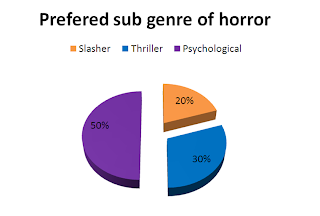

This question directly relates to the content of my opening sequence. The results show that psychological thrillers is the preferred sub genre of horror. Now when planning my sequence I know that it will be a good idea to include conventions (such as twists, enigma codes etc) from this sub genre because it will appeal to my audience.


Question 4
What are the three things you expect to see in the first few minutes of a horror film?

This was an open ended question to try and get suggestions from the audience of what they expect to see. I am familiar with the conventions of horror but not all are suited to everybody. I wanted to find out which conventions most appeal to my target audience of young adults.

The top three suggestions were:

  • Death
  • Blood
  • Characters
As these were very popular I will try to include all of them. As Halloween has just passed I made sure to stock up on props including fake blood so this will not be a problem.

There were also other obscure answers including 'something that is possessed' and even 'a bunny rabbit'. But each of these only occurred once, this means that they are not very popular. I need to include things that will appeal to the widest range of people such as the more popular answers. Therefore there will be no possessed bunny rabbit in my opening sequence. 

Question 5

What do you think of the titles being in Latin? Is this A good Idea?
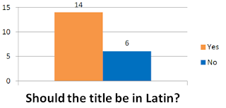
I came up with the idea of the title being in Latin. I thought of this because the story lines of a lot of horror films have ties into history. It makes the whole thing seem more sinister.

14 out of 20 people agreed that this would be a good idea. As the majority thought this I think I will present the title of my film Latin.

Question 6
What could the title of the film be?

After reading my story line I asked people to come up with some ideas of what the title could be.
Here are some of my favourite suggestions and why I think they are suited:

Somnium - Latin for 'dream'. This would fit with the storyline and the theme of dreams.
Bloody nightmare - I wanted to stay away from the word 'nightmare' because of the similarities to Nightmare on Elm Street. Although it does translate into 'Nocte Cruenta' which would be a good name.

I will do some more audience research into the title of my film to find out what people think of these specific titles.

Question 7
What do you think of the story line?

Here is where I ran in to a bit of trouble. I didn't realise until I collected in and read these questionnaires that my story line is incredibly similar to that of 'Nightmare on Elm Street'. In one light 'Nightmare on Elm Street' is a very popular film so taking aspects of that story line could be a good idea. The danger comes in the fact that it could end up being too similar. Everyone that didn't recognise the similarity thought it was a really good concept. Some comments I got included 'Great!' and 'Really good would freak me out'.

Based on this I plan to keep my story line relatively unchanged but I will take care to make sure it is not to similar.

Question 8
 Blood is used in a lot of horror films, how do you prefer it?
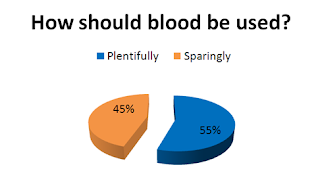
The question is really important. Many horror films shoot them selves in the foot by overusing or under using blood. I need to make sure I get the balance right. If is over used it will look tacky and take away from the credibility of the whole opening sequence. Similarly if it is under used the genre may not be as apparent as I want it to be.

My audience were varied in their opinions. Obviously from my data I can see that somewhere in the middle would be perfect. So I aim to use a realistic amount of blood. But, I don't know how much someone bleeds when they get stabbed, I am not familiar with the realistic amount of blood someone looses if they were to be shot. I need to do some research on this.

Question 9
 What kind of sound do you find scarier?

I don't know much about soundtracks. From my research the music used can be either subtle, loud or even non-existent. I asked my audience which they find scarier.

I can see clearly that most people find silence and subtle music scarier. Therefore that is what I have decided to use. One of my friends is a very talented musician and I have already asked her to help me out on this. Luckily for me she is more than happy to compose a short piece of music that I can use.


Question 10
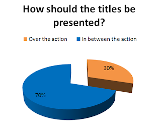
Should the opening titles be presented over the action or in between the action?

I was torn as to which technique to use. I feel that over the action titles can draw from the action and be distracting but similarly I think having them on screen in between the titles takes away from the pace.

Fortunately 70% of of the surveys came back saying that they liked the titles to be in between the action.   I think I will be able to use this method effectively so this is how I will present my titles.

Question 11
Rate these in order of importance.


I wanted to know what the target audience finds most important in an opening sequence so I know what to focus on when story boarding and scripting. I gave four options, these were; characters, dialogue, action and setting the scene.

The majority ordered them like this:
Most important:                  Setting the scene
Second most important:      Action
Second least important:      Establishing the story
Least Important:                 Dialogue

I now know how important it is to set the scene and the tone of the film in this opening sequence and that this is what I should focus on. I have also learned that audiences don't expect or need to much dialogue in the introduction of the film.

I will take this into consideration when planning my opening sequence.